
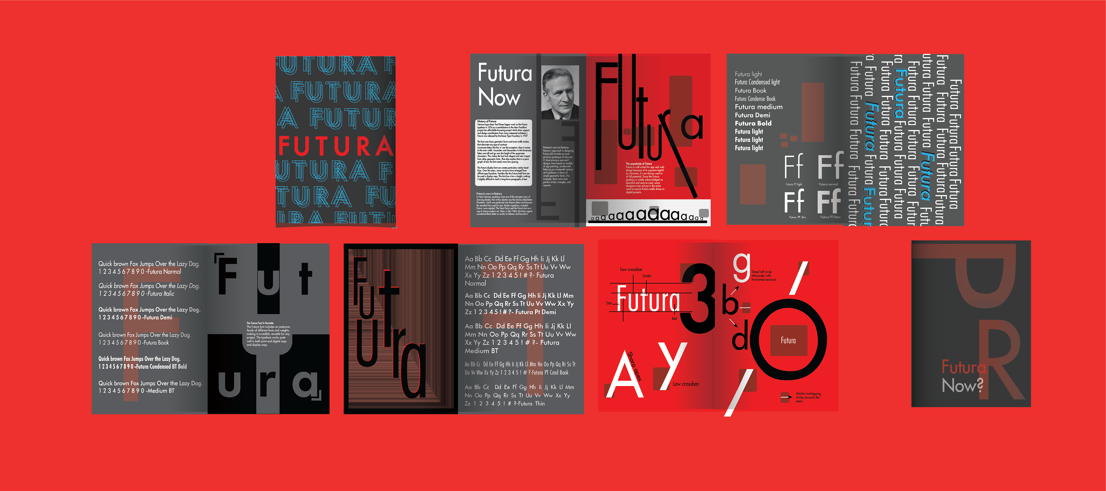
A spread of something bold yet modern...
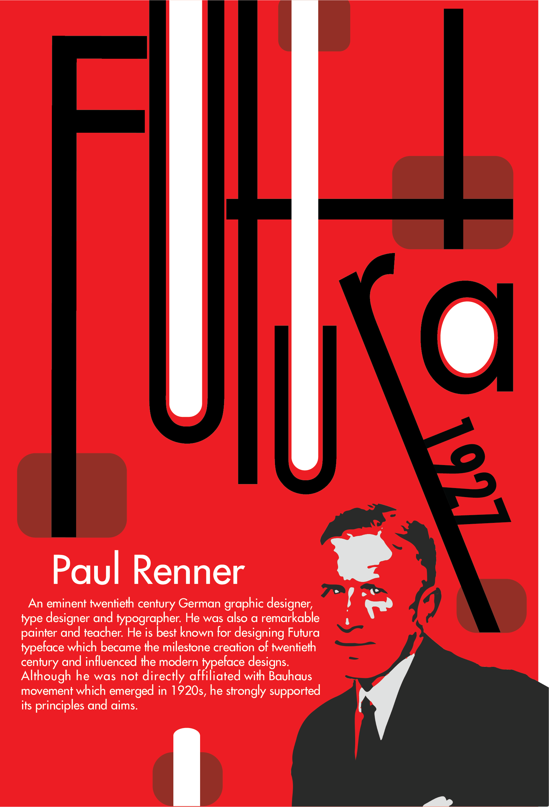
This poster is intended to teach people who Paul is and what font he created.

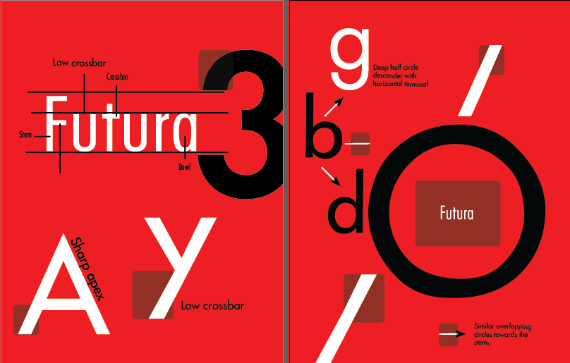
The image above is my spread of my type anatomy from the famous type man himself Paul Renner.
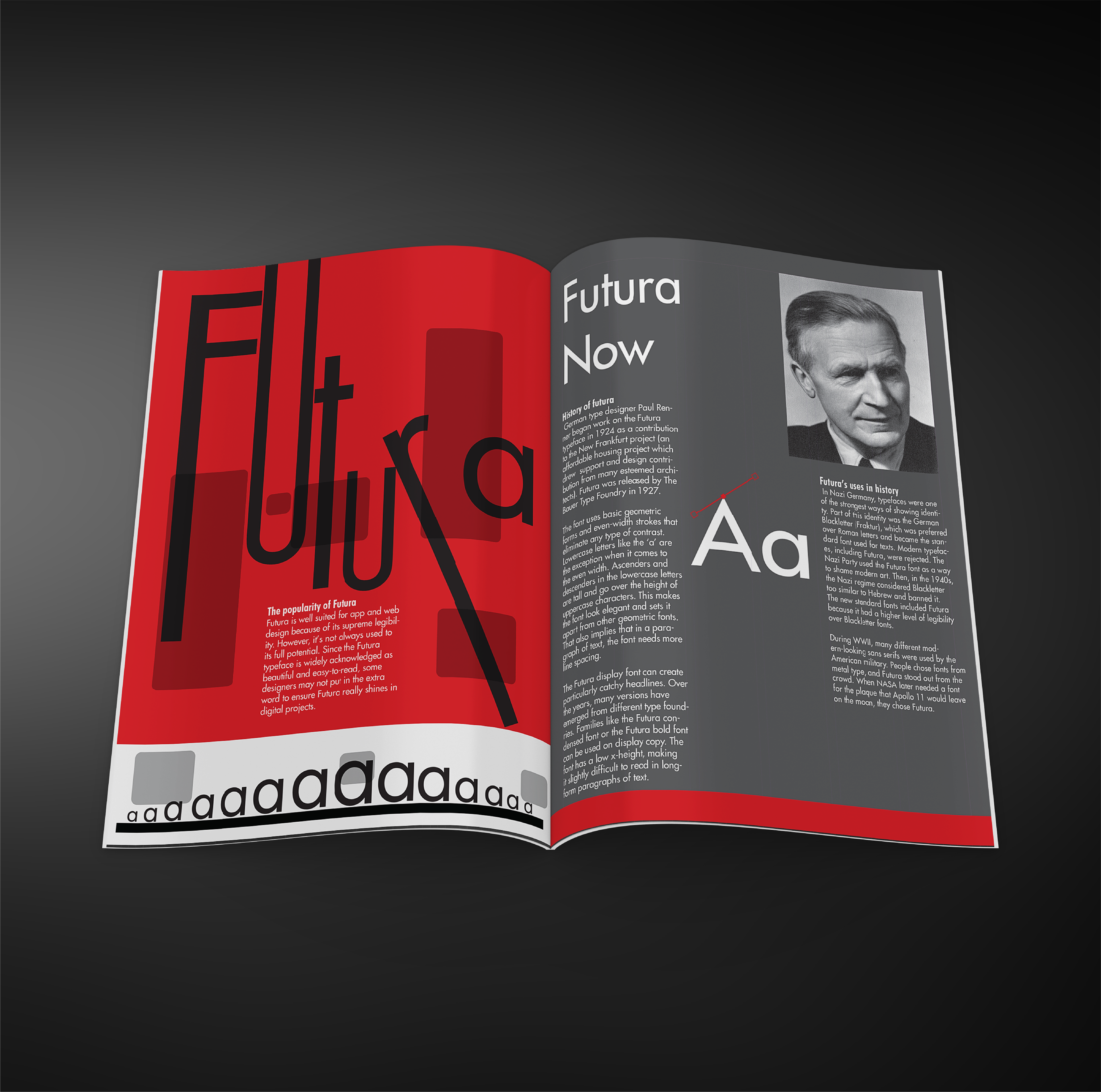

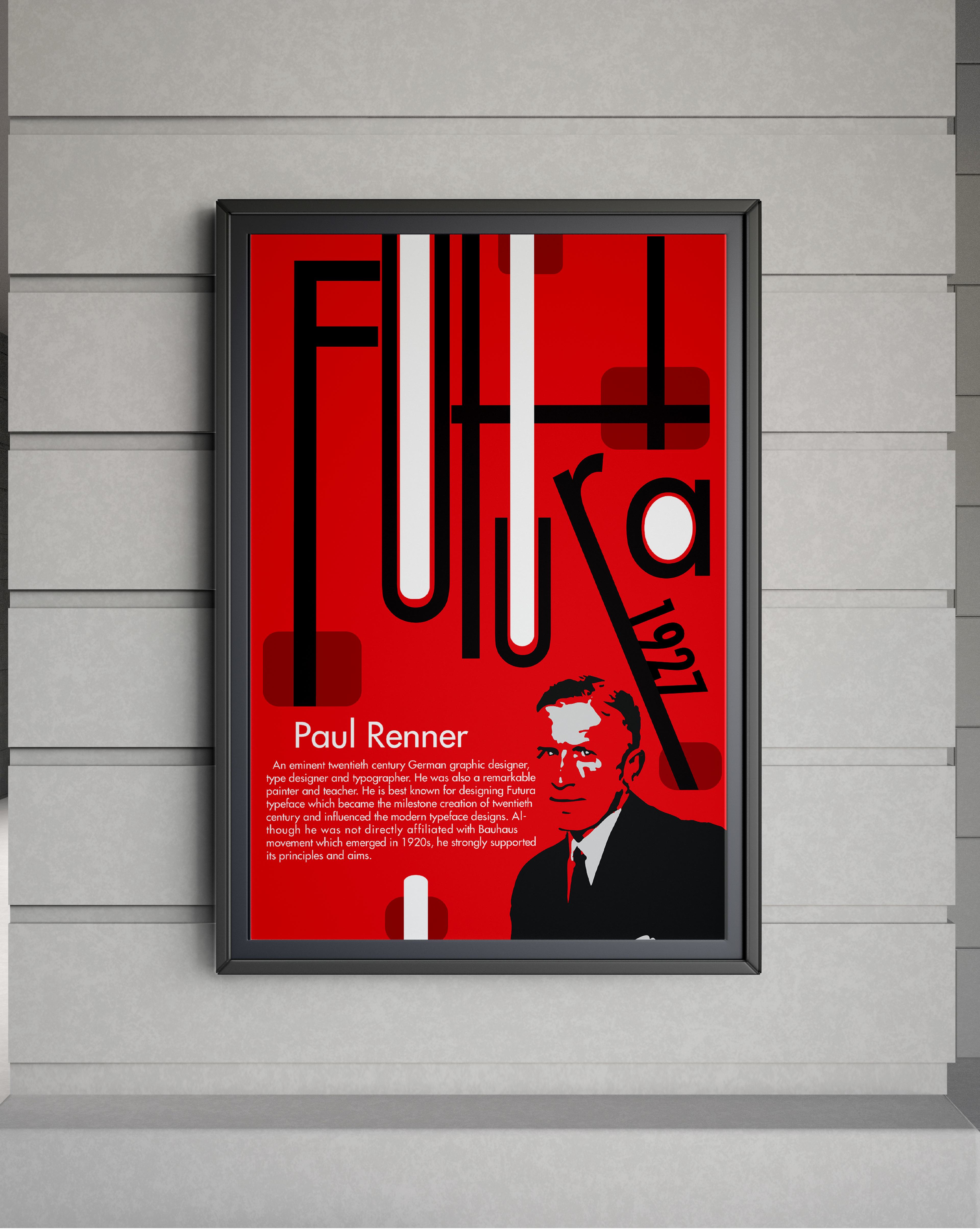
These are the past and present versions of my booklet pages. I wanted a more modern look that looks clean. I decided to keep the anatomy chart to the left, then I experiment with the colors red, white and black.